Tubarão Wines Label Design

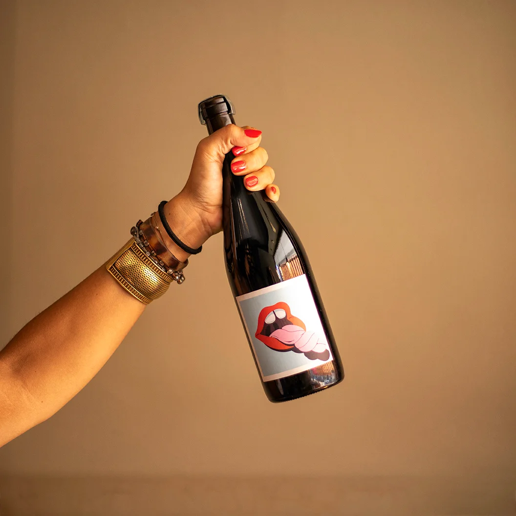
I designed the label for Tinto de Ramadas, a wine by the natural winery Tubarão Vinhos. The challenge was to create a bold, eye-catching label that would stand out on the shelf.
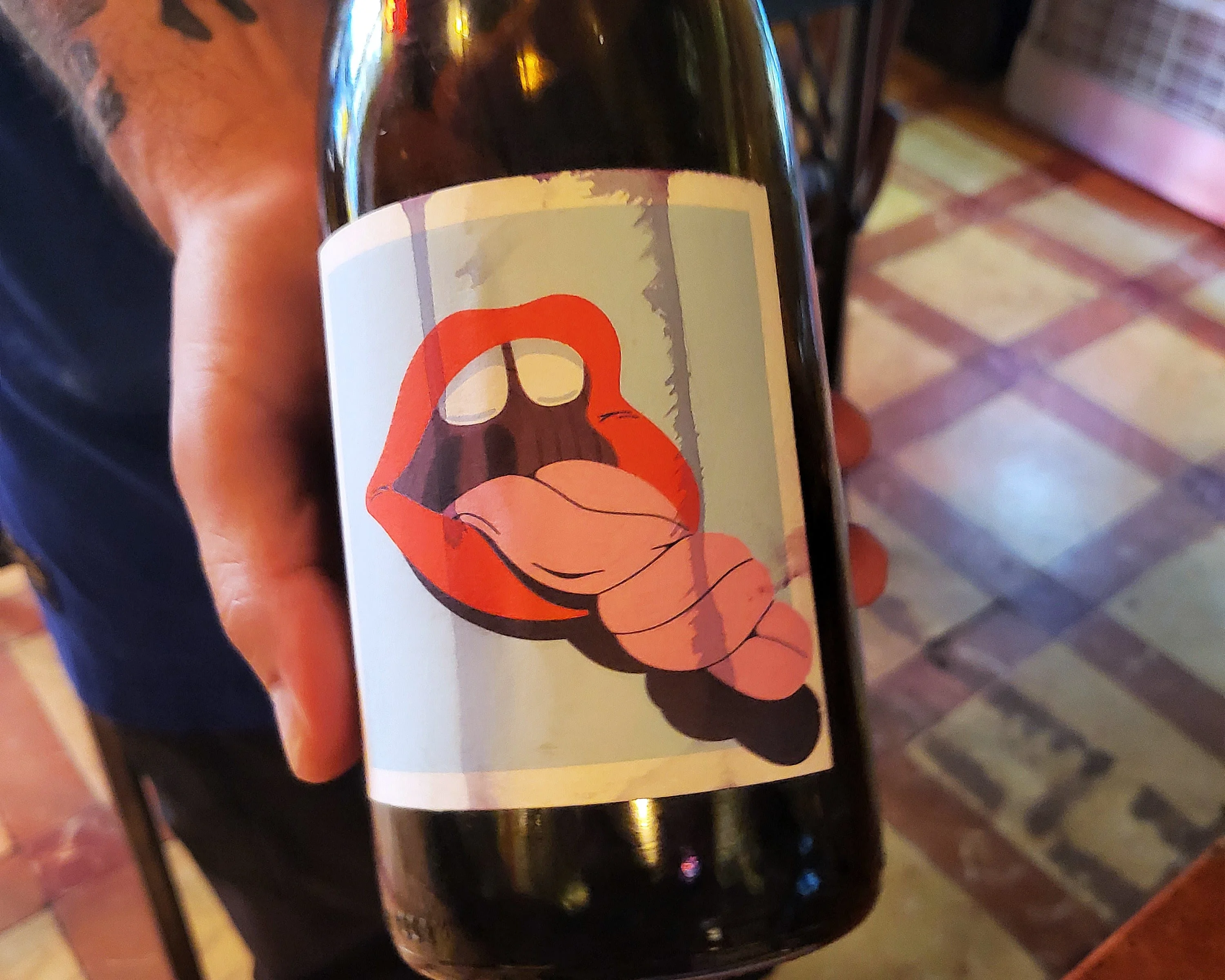
Tubarão Vinhos wanted a label with real shelf presence for their Tinto de Ramadas. They felt my earlier illustration, Tongue-Tied, a tongue tied in a knot, was a fun way to represent the wine’s lively acidity, so the label is an adaptation of that artwork.
Tubarão Vinhos wanted a label with real shelf presence for their Tinto de Ramadas. They felt my earlier illustration, Tongue-Tied, a tongue tied in a knot, was a fun way to represent the wine’s lively acidity, so the label is an adaptation of that artwork.
Creative Process

The Original
They loved this illustration I created as a starting point, but felt it looked too feminine.

The Drafts
Create quite a lot of variations, ones tried out a moustache.

The Adaptation
They loved this illustration I created as a starting point, but felt it looked too feminine.
The Result