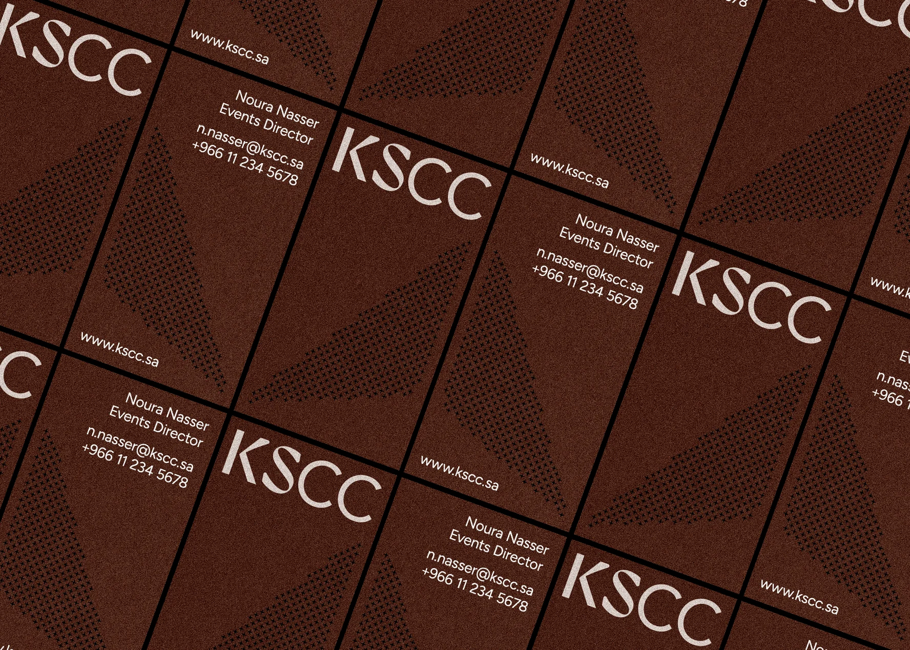
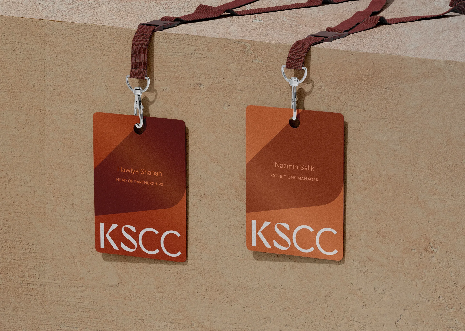
King Salman Convention Center Brand Design
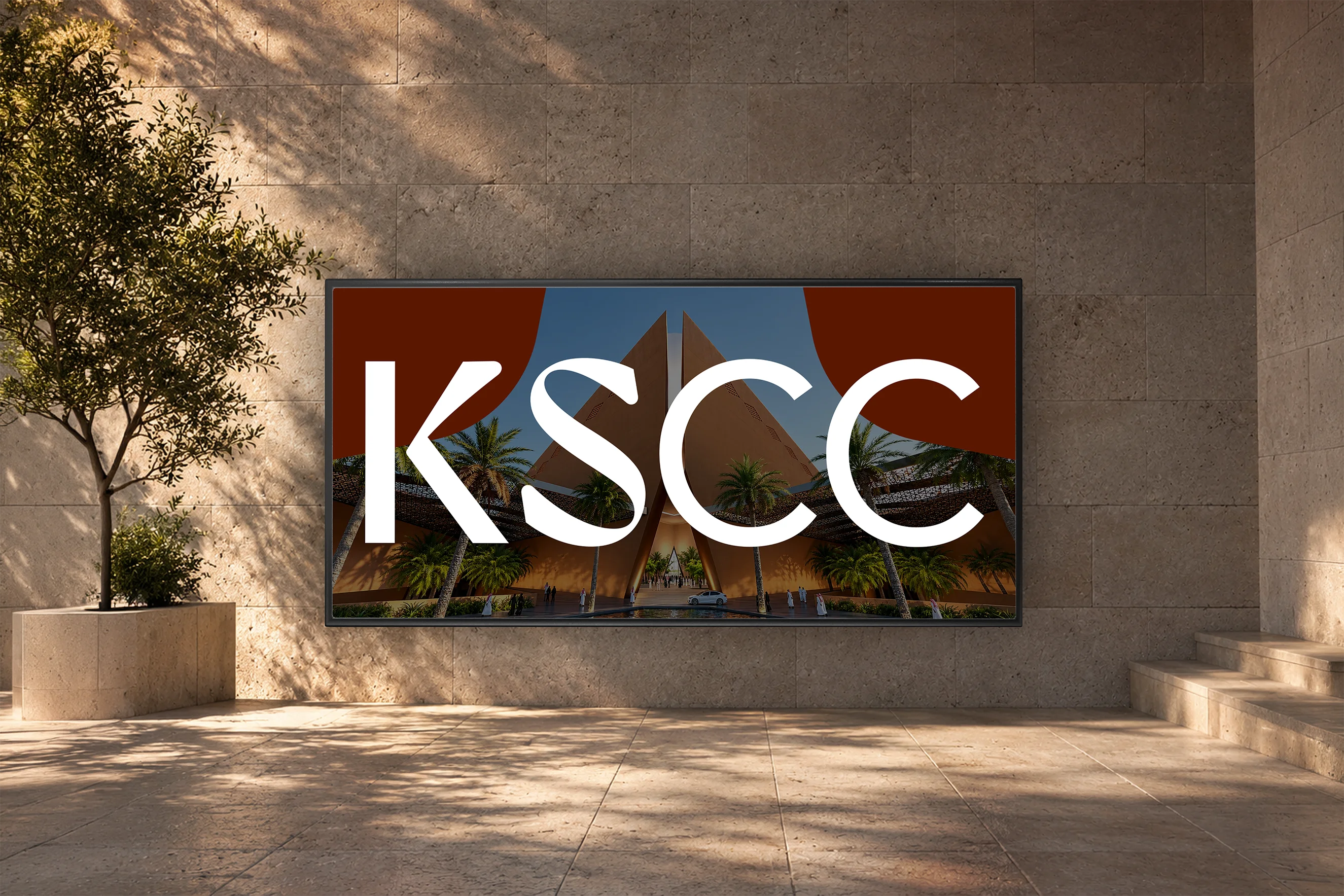
I developed a brand identity proposal for King Salman Convention Center while working at VML Branding. The center was envisioned as a landmark venue in Riyadh’s King Abdulaziz Park, designed by Foster + Partners to host the most exclusive and innovative events.

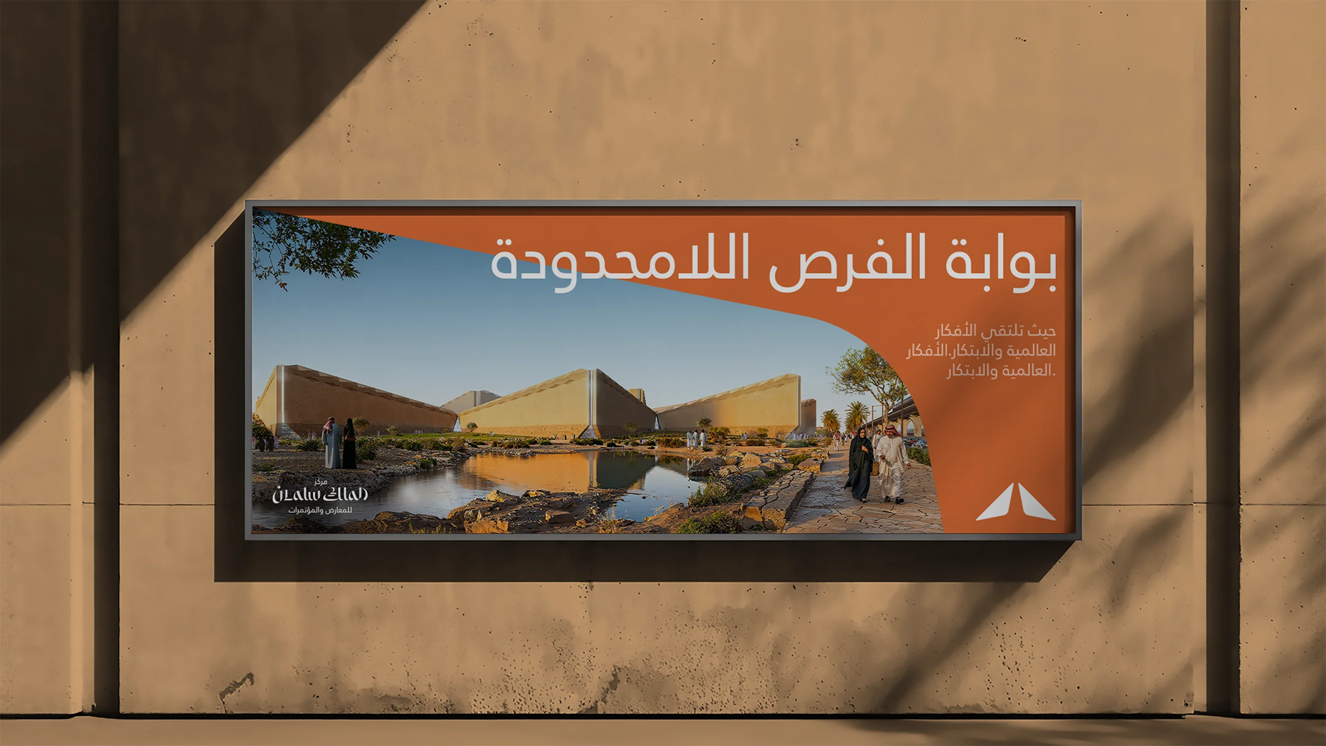
The architecture had a strong identity and was designed to blend with its natural surroundings. It was so distinctive that it had to be part of the brand’s DNA, and so it became the main source of inspiration for the visual identity.


The logo's symbol draws on the building’s main entrance, representing a gateway to the extraordinary, redesigned to feel modern and translate well in the digital world.
The logotype combines the open gateway symbol with the wordmark in three versions: a bilingual lockup with the symbol at its centre, and separate Arabic and English versions, each carrying equal weight. In both scripts, the letterforms follow the symbol’s design: a gap separates the two parts of the entrance, and the same gap appears in the bridges of the letters.

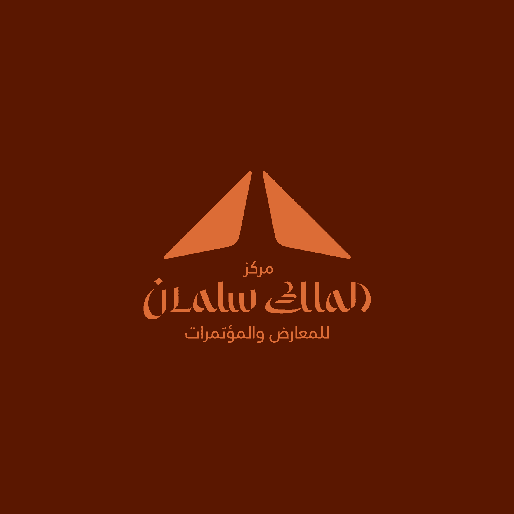


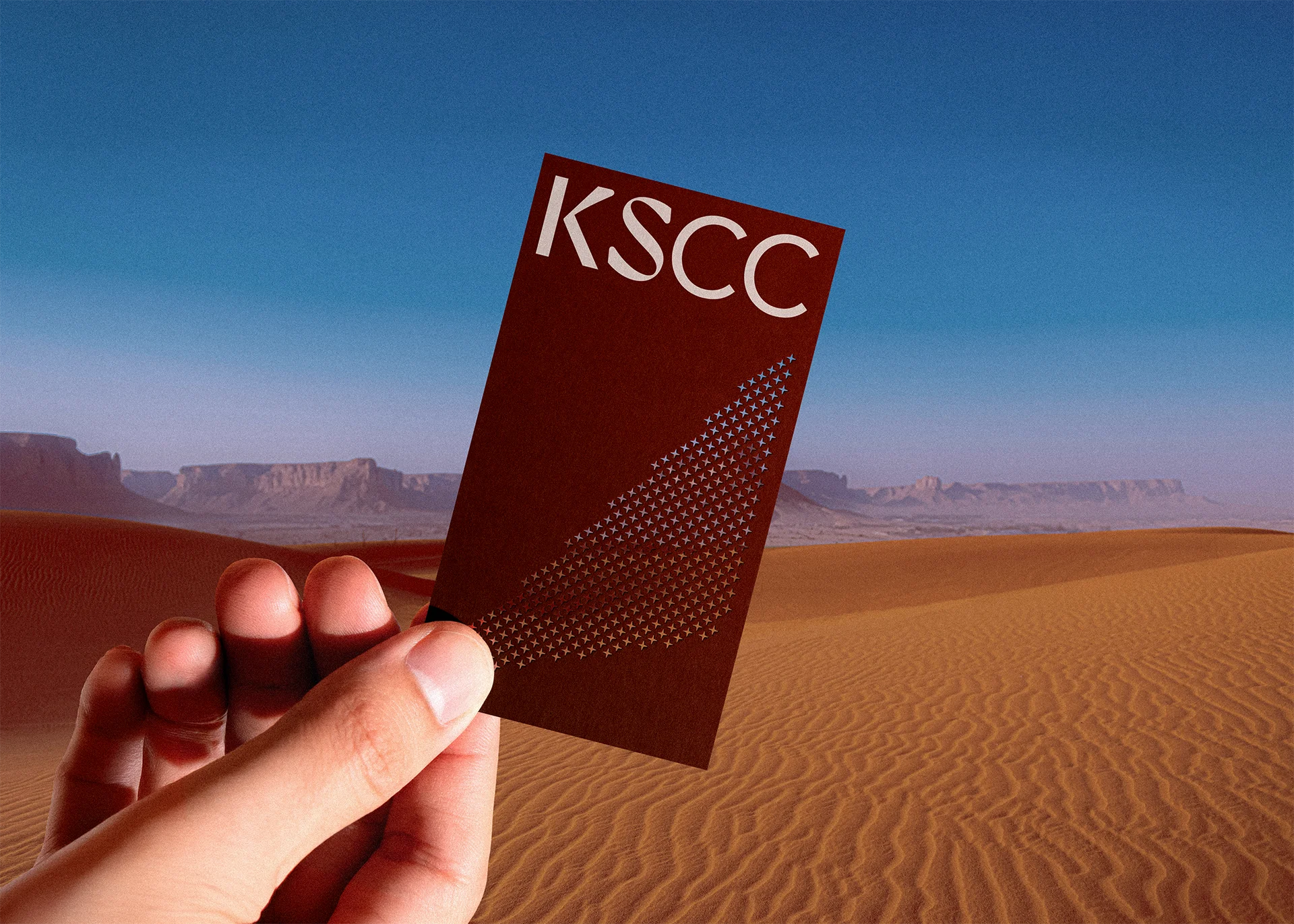
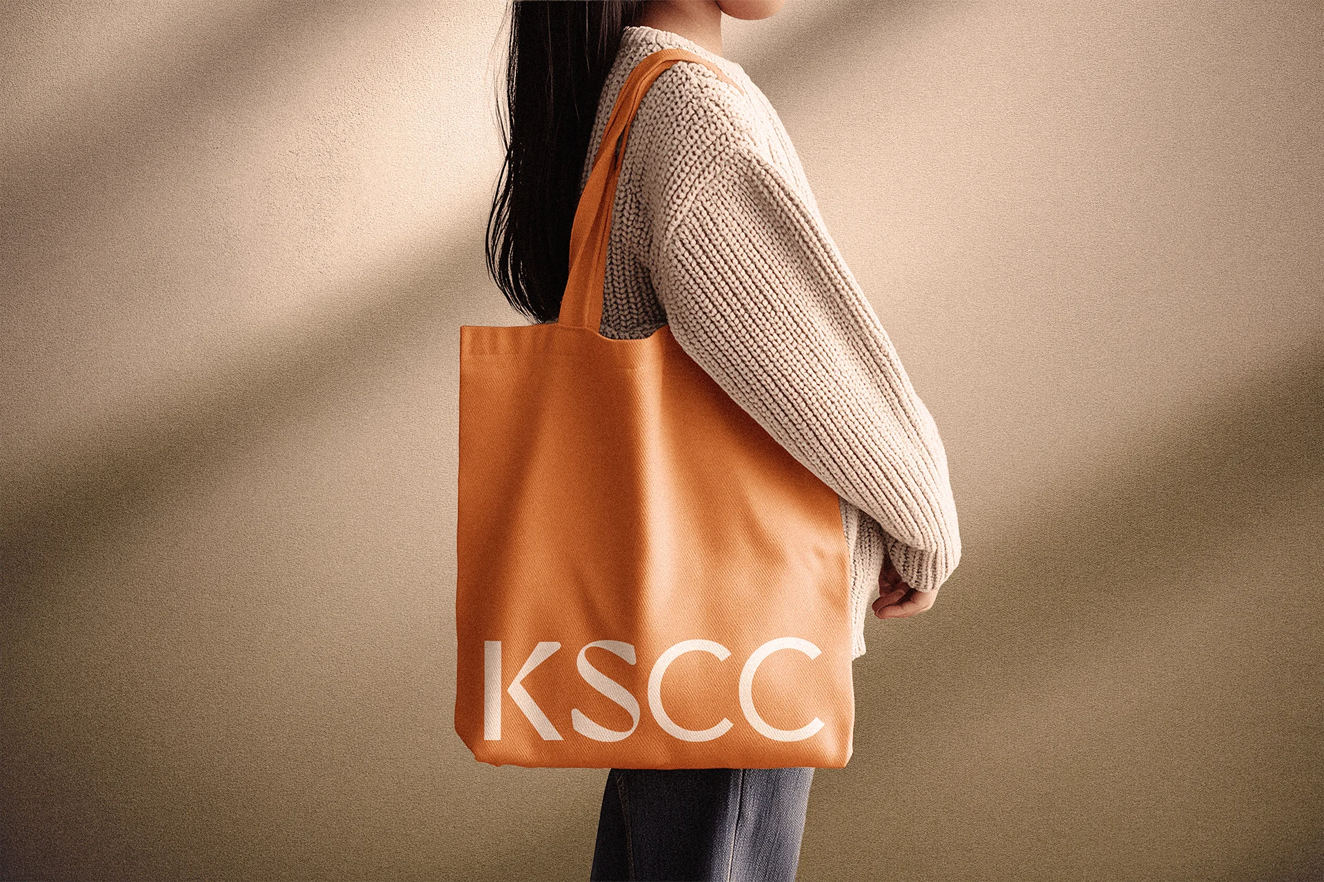
Alongside the main logos, a set of variants covers every format. English and Arabic are stacked for vertical layouts, and the KSCC mark offers a compact option for small sizes and quick recognition.

Taken out of the logo, the symbol becomes a graphic device for the brand.
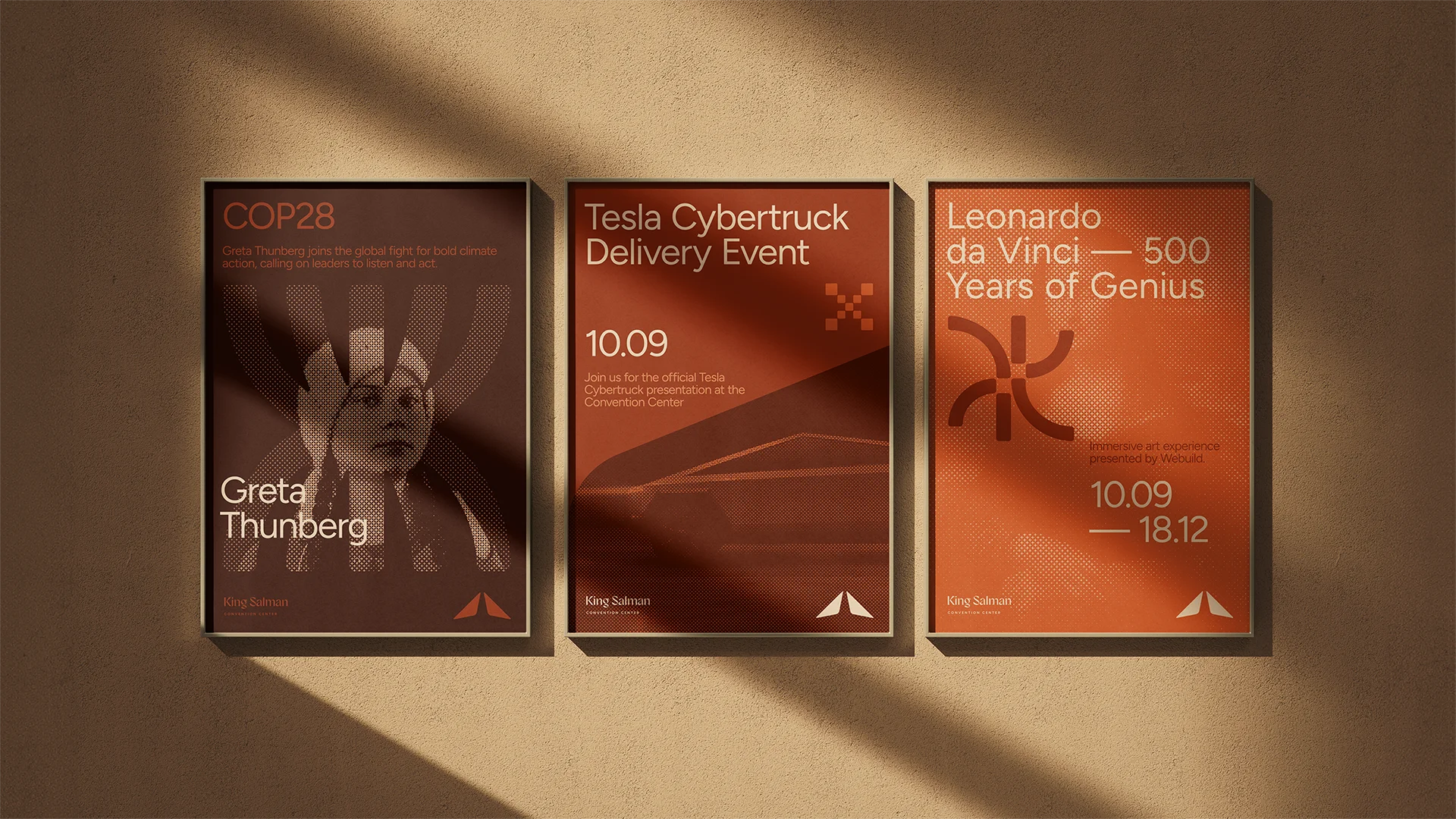
Used on its own, the symbol becomes a graphic device that gives every piece of communication a link back to the architecture that inspired it.


The palette comes straight from the architecture and its natural setting. Warm tones reflect the building’s walls and the surrounding environment. Figtree and Janna LT are clean sans-serif typefaces that give Latin and Arabic text a contemporary tone.
The negative space between the symbol and its reflection forms an emerging shape. It becomes the unit of a halftone filter that gives the brand’s imagery its distinctive texture.
A set of icons was developed to categorize events and make their themes easier to identify at a glance. Like the logo symbol, they have rounded corners, and a simple, geometric design to keep them legible even at small sizes.