Epifania Wine Brand Design

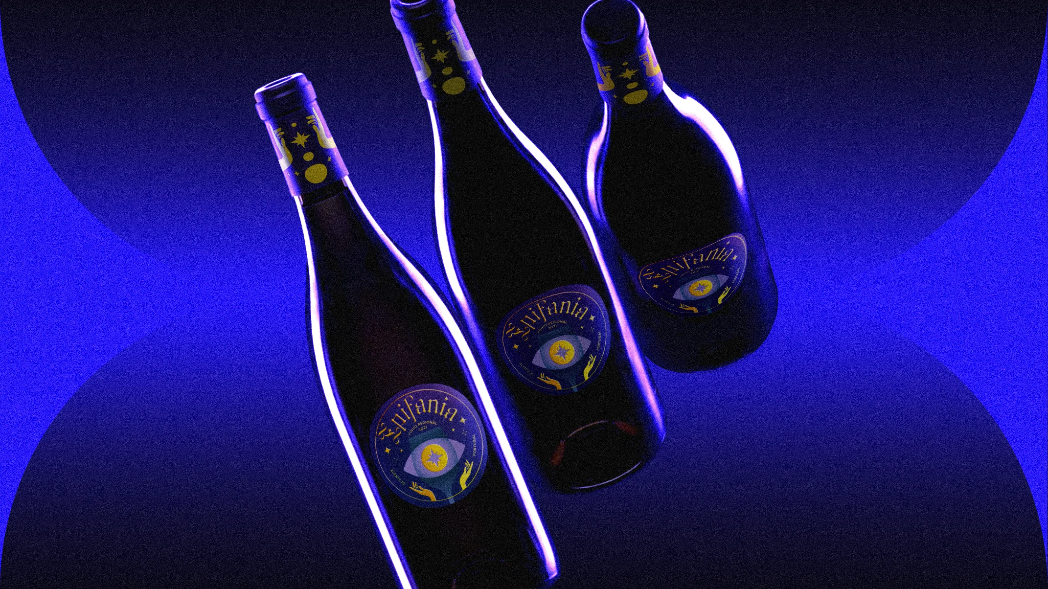
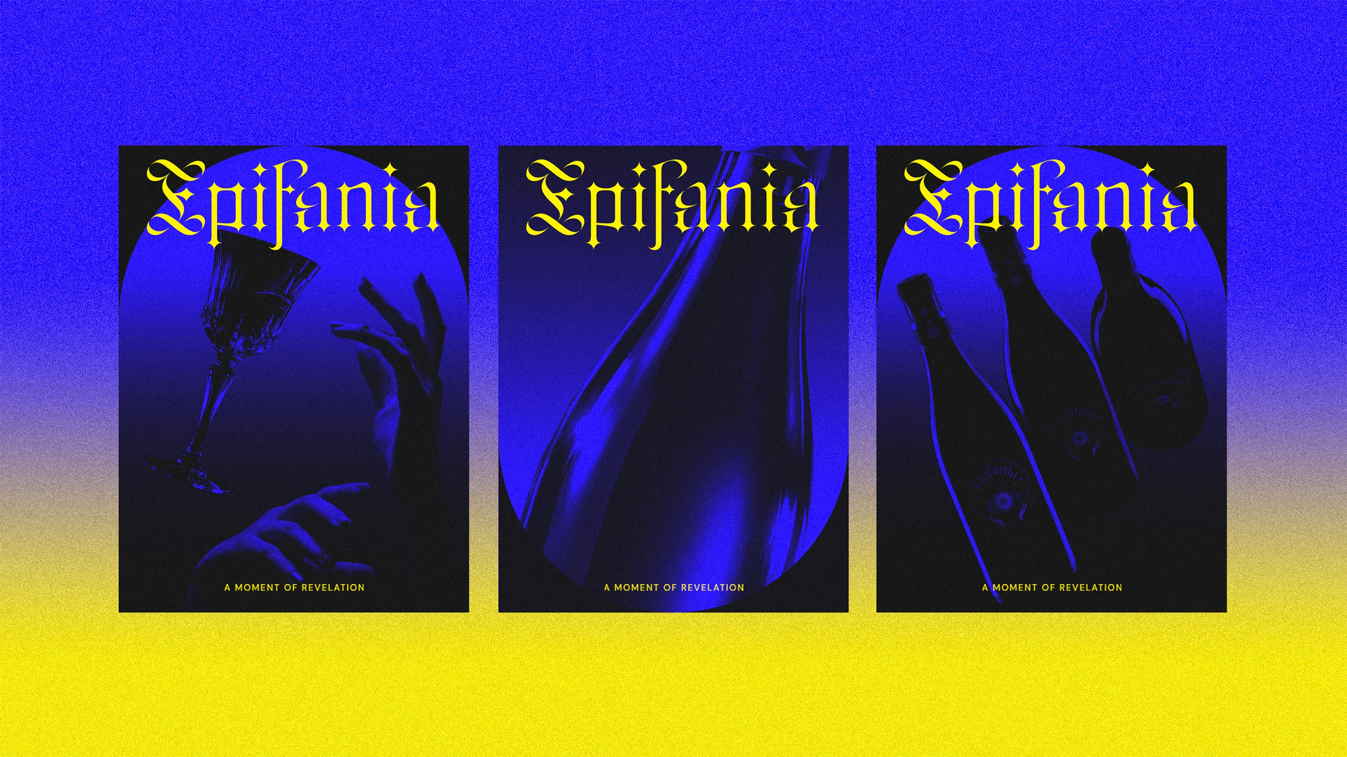
The design for Epifania captures the transformative moment when mystery turns to clarity, when a sip of wine becomes a key to hidden knowledge. The label centers on an all-seeing eye, revealed through the shape of a wine glass, as if insight itself is only visible once lifted to the lips.



Creative Process
How it started
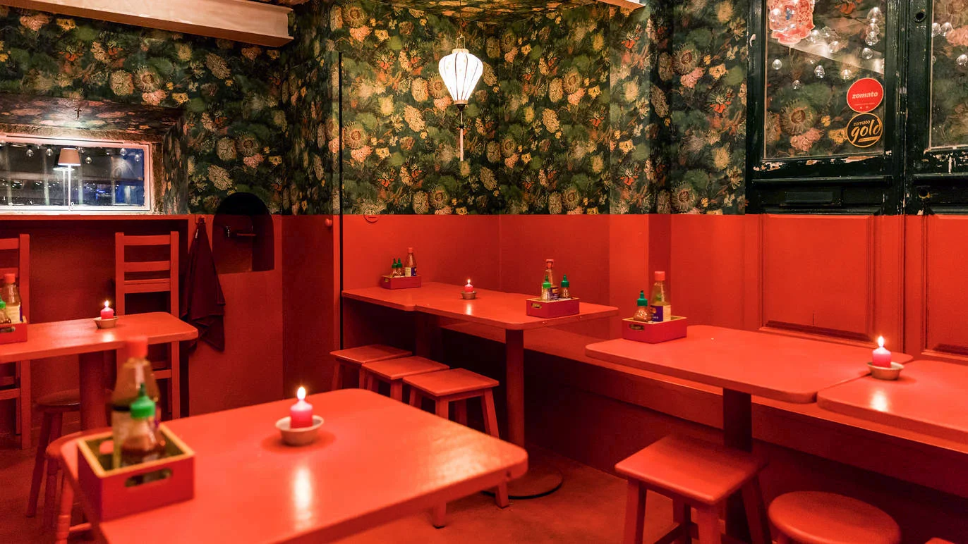
By the time the owner approached me to design the logo, renovation of the Phôfinho restaurant space had been underway for about a year. Although the visual identity hadn't yet been created, the restaurant already had a very distinct personality: the whole bottom half of the interior was dipped in red. And not only that, the name itself was a pun on the word "fofinho" (Portuguese speakers will know), so it also had a whimsy nature.
The top half of the walls was covered in wallpaper based on a detail from Van Gogh's Vase with Chinese Asters and Gladioli. This stylistic choice had no particular rationale behind it, so I didn't factor it into the brand's inspiration.
First draft
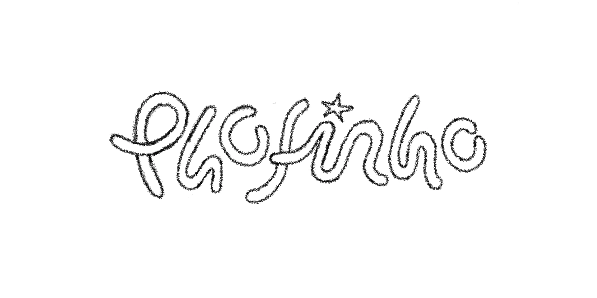
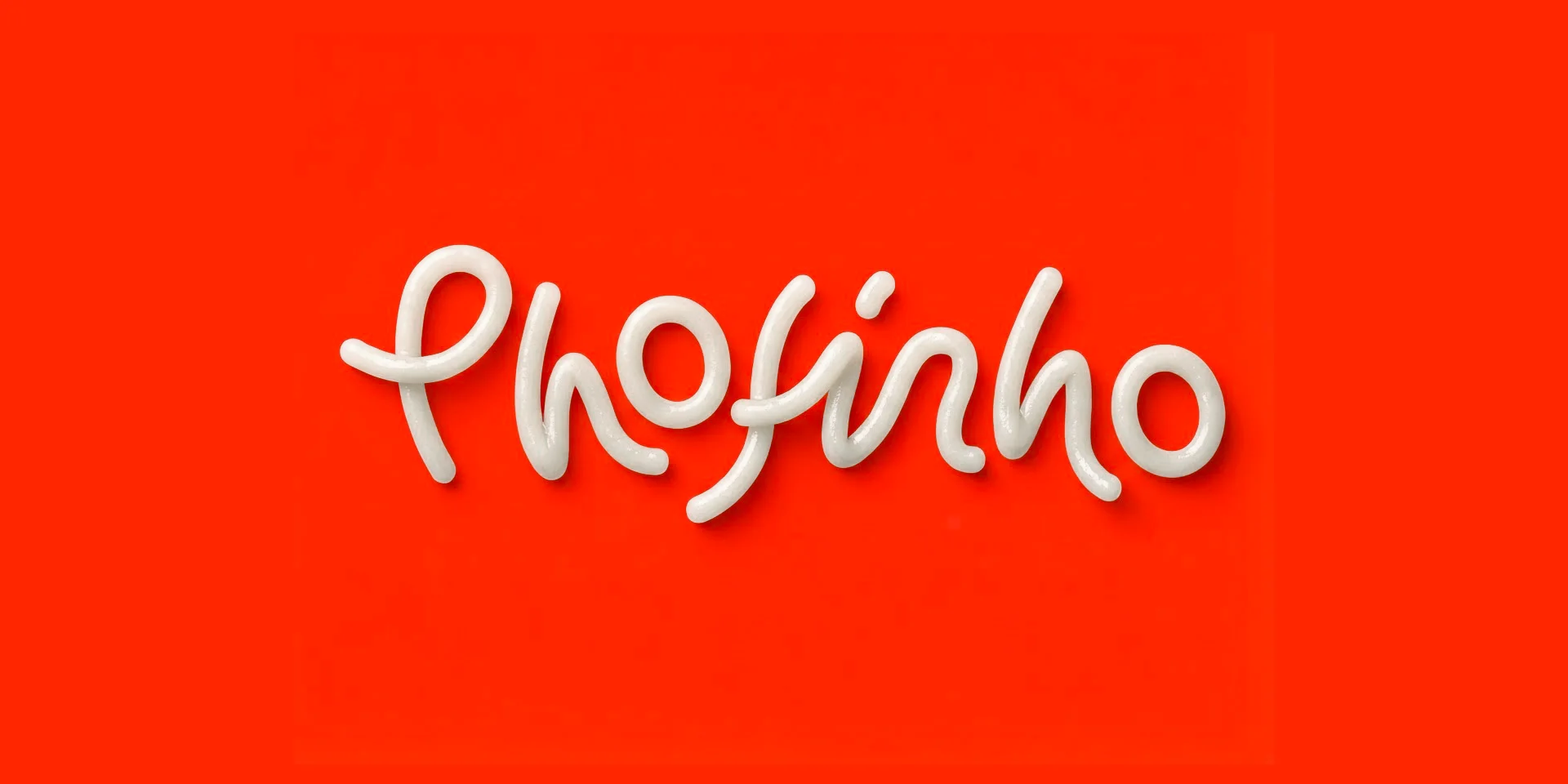


Second draft
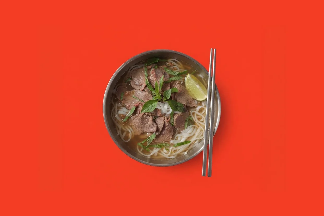
On another study I decided to focus on the pho dish itself. I explored different ways of representing a bowl, trying to stay faithful to the fun personality of the brand. And that's how I arrived to the final version. It worked well as a symbol, but it also turned out to be a potential mascot.
It made sense to have a friendly pho bowl as a mascot, and that would open up a lot of fun design ideas down the line. Another advantage of having a mascot is the ability to give the restaurant a persona, by exploring its human side through facial expressions to communicate various emotions. This would also subtly diminishing the overtly commercial tone.



Scaling
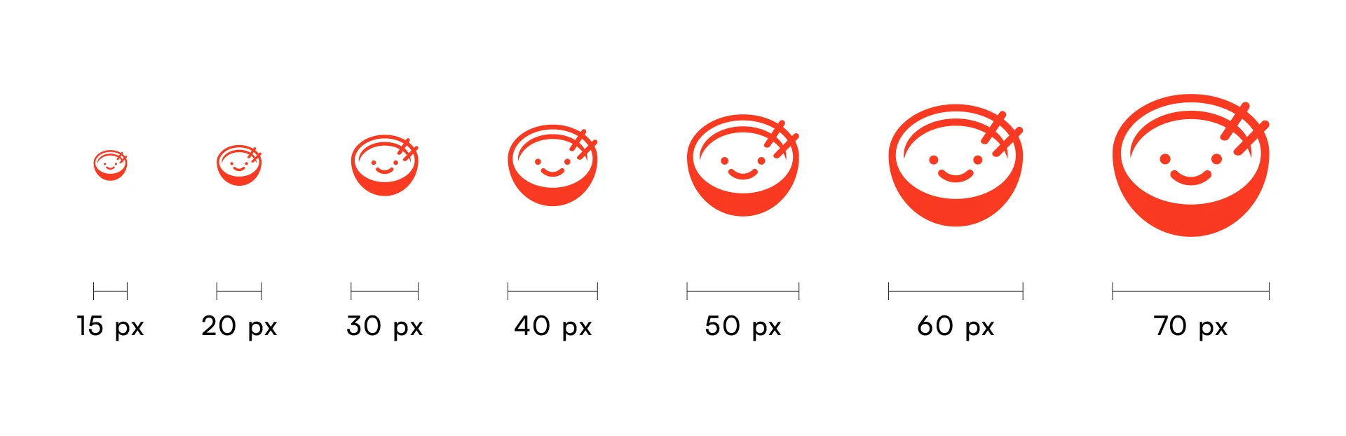
As the symbol shrinks, fewer pixels are available to render it, which can cause distortion. The minimum recommended size is 32px on retina displays, matching the standard favicon size. The bowl design balances detail and simplicity, staying clear and recognisable even at small sizes on screen.
Wordmark, main typography and colour scheme

The wordmark for the logo is bright red, bold, and in uppercase letters, ensuring high visibility and legibility from any perspective. The rounded corners soften the overall look, creating a friendlier appearance.
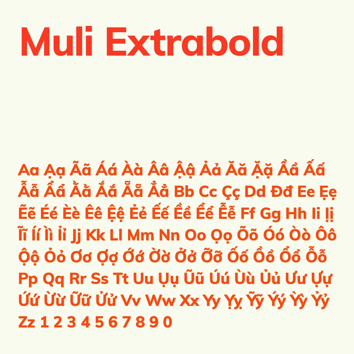
The main typography of the brand is Muli Extrabold because it has a strong Vietnamese diacritic support. It's also soft and round which matches the brands's personality.

The brand's main colour is, of course, red, with ivory as the secondary. Ivory complements the red while adding a warmer touch than pure white.
Logo Variations